ParrotTalk

June 8, 2011

New Parrot and Angelica Labels Feature Our Photographer Friends

Filed under: Uncategorized — admin @ 2:24 pm

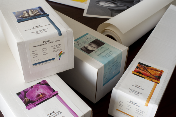
We here at Parrot Digigraphic are celebrating our long tradition of collaboration and partnership with Photographers and Fine Artists with the release of an entirely fresh re-design by designer and illustrator Jennifer Manganello for our Angelica and Parrot inket media labels, featuring the work of Photographers Bob Bergeron, David Saffir, Dr. Nicholas Hellmuth and Thomas Balsamo.

Parrot has worked in collaboration for nearly two decades developing media that meets the needs of fine-art reproduction, such as the collections produced by Bergeron at Tri-Color Graphics, the delicate and subtle Black and White tones of Thomas Balsamo’s sensitive portraits… or the vibrant color pallets of the work of David Saffir and Dr. Hellmuth. Through these partnerships Parrot has developed a media line without equal, including Parrot and Angelica Fine Art Watercolor papers, high-gamut Canvas, gloss, matte and luster Photo media as well as a versatile array of vinyl and film signage and display materials.

From John Lorusso, President of Parrot Digigraphic:
“We have a long history of collaboration with artists and photographers, and we feel that this is a good start in honoring our relationship with our valued partners. We greatly appreciate the support of our friends, clients, and colleagues.”

Lorusso continued: “Fine Art papers are like the finest wines – the choice of the right paper for an image, or series of images is an intensely personal decision, and intimately linked with the creative process. At Parrot, we’re constantly striving to give our clients the finest materials to select from.”

For more information of the featured photographers, see their respective websites:

Bob Bergeron: Tri-Color Digital – Fine digital printing, scanning and art reproduction services

Thomas Balsamo: Portraits by Thomas

Dr. Nicholas Hellmuth: Flaar Reports – Imaging Equipment testing and evaluation.

David Saffir: David Saffir Photography – Commercial and Fine Art Photography, Fine Art Printmaking, Photography Workshops

April 13, 2011

The Inventor of the Digital Camera Speaks: David Sasson

Filed under: Uncategorized — admin @ 10:43 am

Inventor Portrait: Steven Sasson from David Friedman on Vimeo.

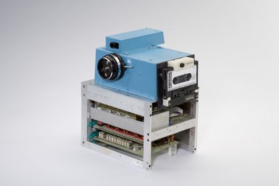
A long while back I did a post called “a Brief History of Digital Photography” with this photo of the first digital camera.  Well, now, thanks to the magic of the interwebs, here’s the creator talking a little about the invention and development process…


1972 – The first patent is filed for a filmless electronic camera by Texas Instruments.

1975 – The first recorded attempt at building a digital camera. The camera weighed 8 pounds, recorded black and white images to a cassette tape, had a resolution of 0.01 megapixel, and took 23 seconds to capture its first image.

1986 – Kodak scientists invent the world’s first megapixel sensor, capable of recording 1.4 million pixels that could produce a 5×7-inch digital photo-quality print.

1988 – Canon XapShot- (Ted sees electronic, albeit analog, camera for first time, lusts.)

1990 – Kodak shows a hacked Nikon body with a Kodak sensor at Photokina called the DCS. It was 1 MP and cost $25,000. It shipped in 1991. The first entirely digital camera is available to consumers. The Logitech FotoMan records in black and white and at less than one-tenth of a megapixel.

1991 – Kodak presents the DSC 100, which is considered the first useful digital camera for general sale. The 1.3-megapixel camera retails at $20,000.

1992 – Kodak introduces the photo CD. Leaf introduces DCB camera back.

1994 – The CompactFlash memory card is introduced

1994 – The Apple QuickTake 100 is the first consumer-oriented color digital camera. It retails at about $1,000.

1995 – The first consumer camera with a liquid crystal display on the back was the Casio QV-10.

1996 – Thee first camera to use CompactFlash was the Kodak DC-25.

1999 – The Nikon D1, the first digital SLR designed and manufactured by a single camera company is released. It is 2.7 megapixels.
(Ted takes last known photograph on film.)

2003 – Canon’s 6.3 megapixel EOS Digital Rebel is available for less than $1,000. It is the first digital SLR to make a major impact on the consumer market.

2003 – Digital camera sales exceed film camera sales for the first time.

2004 – Kodak ceases production of film cameras.

(creds to PlanetHunt.com- That’s What She Said)

-Ted Dillard

March 2, 2011

Artist Profile: Thomas Balsamo

Filed under: Uncategorized — admin @ 3:33 pm


Have a look at Thomas Balsamo’s portraiture and you’ll see some truly beautiful photographs. Honest, yet flattering images with a sensitivity and luminance that recalls the classic masters of photographic portraiture: Horst, Hurell, Karsh… not bad company to be in. Read his mission statement: “…to create portraiture that speaks volumes about the subjects we capture. We want to thrill, captivate and compel you, the viewer, to linger on our work.”, and it’s difficult to resist feeling moved by his work.

Dig a little deeper and you discover a deep, abiding commitment to philanthropic work. His book “Souls Beneath and Beyond Autism” is clearly a labor of love, an effort to give of his own talent to “…break apart stereotypes associated with autism while illustrating the transforming power of love.”; “i have a voice”, a traveling show describing the unique view of children and adults with Down Syndrome: “To see a world through eyes that don’t judge. To love with hearts that don’t discriminate. To look at people for who they are. And accept them for simply that.”; work with the Cystic Fibrosis Foundation, the Evans Life Foundation, and many others…

About this work, Balsamo says:
“My hopes and dreams are to inspire others to find, develop and use their gifts, passions and talents to make a fulfilling career while making contributions to society. What a great place the world would be if everyone would operate in this space. I have never had a job, because my portrait work has been a labor of love. I have been so privileged that my portraiture has been used to raise millions of dollars for non profit organizations. I am so thankful to have had 30 incredible years of creating portraiture.”

This modest statement belies some impressive accomplishments: Thomas’ images of individuals dealing with Autism have been have been displayed in 800 Toys R Us and Babies R Us stores, and across the country, since 2007. 6.5 million dollars have been raised from the Faces of Autism Campaign.

Here, deeper still, you find the core of what motivates Thomas Balsamo. Balsamo’s goal is to inspire artists to create, to build, to strive to make the world a better place with their work and vision. “Change comes from the artists. Artists have the power to make people aware, to inspire, to provoke thought and emotion, to make a real difference. Think of the Renaissance… it all came from Art.” Through his own work he strives to show what can be achieved with talent, vision, and a commitment to making a change in the world. Thomas states in his description of “Souls Beneath and Beyond Autism”, “…The greater purpose, beyond autism, is the universal message that from the depths of darkness often we find the greatest enlightenment. The individual with autism is a beautiful metaphor for this belief.”

The greater purpose of art, for Thomas, is the same. From the heights, or depths of the creative spirit, we can achieve the greatest enlightenment… and often the greatest good.

In considering the power of the artist, and their gift of talent, Balsamo’s work reminds us of the wonderful sentiments of Helen Keller: “There is no better way to thank God for your sight than by giving a helping hand to someone in the dark.”

See more of Thomas’ work at his site: Portraits by Thomas.

Learn more about his philanthropic work here, on his blog, as well as a complete picture of Thomas’ studio.

His book, SOULS: BENEATH & BEYOND AUTISM is available from Amazon.

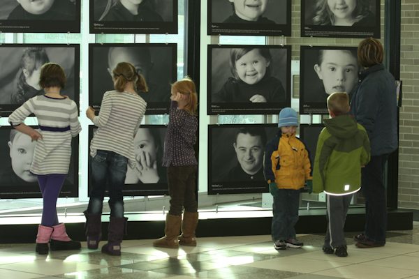
Thomas has a lot of wonderful photographs on his site…  but our favorite is this simple shot of a group of “his kids” at a reception at the Woodridge Library, seeing themselves through Thomas’ eyes…

-Ted Dillard

March 1, 2011

The Secret of the Cruse? One Word. Lighting.

Filed under: Uncategorized — admin @ 11:41 am

There’s one simple reason why the Cruse Camera is better than anything else.  It’s the lighting.

If you have some experience with copy and repro photography, some of this may be old hat, but bear with me.  I guarantee a “Eureka!” moment.  If this is new, then hopefully it’s helpful in understanding some of the basic principles of reproducing flat art.

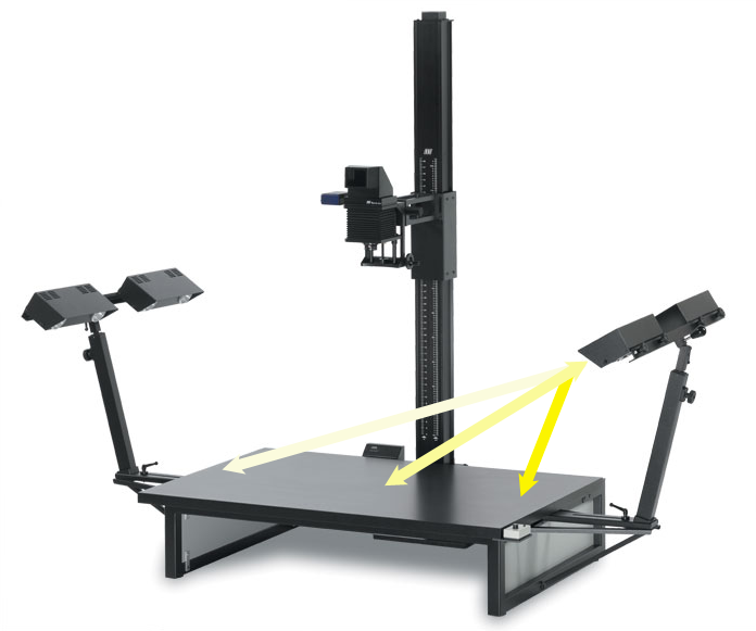
Let’s start with how it’s done traditionally.  Here’s a top-of-the-line repro copy stand with a standard four-light array.

If you’re following along at home, the formula is this: Each light is 45º off the axis of the table, measured from the center.  Each light is the same distance from the center point of the table.  Here’s a secret of getting balanced lighting- you aim each light at the far side of the table. This helps overcome the Inverse Square Law.

Oh, snap.  Math.  Well, simply put, the Inverse Square Law is a basic law of Physics, and without all the math it means that your light falls off really fast as you move further away from it.  It’s drops faster than just the distance, that is, moving something twice as far away cuts the light not by half, but by four times…  that is, the light at twice the distance is 1/4 the intensity.  Note the arrows, and the distance of the table from each light.  See the problem? Even from this rough diagram, the distance from one light to the far side is more than twice the distance to the near side of the table. There’s a ton of difference in the resulting luminance.

Here’s a basic diagram of a traditional copy setup, from the camera’s eye.

That’s the table where the art is going to sit, and those four blocks are the lights.  Now.  Because of the Laws of Physics, here’s what the lighting pattern is going to look like…  exaggerated for the sake of clarity, but nonetheless, this is what we’re fighting.

It really doesn’t matter what you do, at some level you’re going to be dealing with the basic Laws of Physics.  I know.  I don’t like Physics either.

Let’s take a look at the Cruse system and see how it’s different.

Here’s the lighting array, with the two strip lights centered on the sample area- literally only inches wide.

Here’s what the lighting pattern looks like:

…getting the idea here?  You have a completely even lighting pattern from one side of the piece to the other, but, more importantly, because the lights are so close and the sample area is so narrow, the intensity of the light is perfectly even.  The issue of the distance of the light from the subject no longer matters, since it’s virtually the same from one side of the sample area to the other.  This is called using Math for Good…  not for Evil.

Here are three shots simulating the Cruse making a scan.

And…  the final scan simulating the lighting:

See what we’re talking about?  Dead-even light from side to side, from top to bottom, without any sort of tricks, plugins or workarounds.

Here’s the cool part.  This demonstrates how the Cruse system works when you’re trying to light something as “Left-Right Even” lighting.  Now, suppose that you want to have a little side-shadow to show the depth of a piece, say…  a painting with a brush stroke?  With a conventional copy stand, that means you kill one side of your lighting, and your even-lighting problems just went ballistic.  Even if you use some very advanced lighting workarounds or software to even the field of the capture, your shadow quality is going to be different from one side of the piece to the other.  Where you’re closer to the light, the shadow will be softer.  Where you’re further away, the shadow will be sharper.  There is simply no way to achieve a true, even sidelight with conventional copy/repro lighting.  There’s no bending of the rules of Physics.

Here’s what the pattern is going to look like with one bank turned off:

Here’s what the Cruse pattern looks like with “Left Textured” lighting, that is, with the right bank turned off:

On the Cruse, once again, the effects of distance from the light source are virtually non-existent.  You want side-lighting?  You got it, from a simple side-light to up to 10cm off-axis, and perfectly even intensity from one side to the other.  You’re not fighting the light, or Physics.  You’re working with the light.

Here’s what that looks like.  This is a top-lit painting, sampled from the very bottom:

Here’s the same scan, sampled from the very top:

With conventional lighting, the top sample would be getting about 200% more light intensity…  here you can see the two areas are being lit precisely the same.  Not only that, the shadow quality, that is, the softness and feel of the shadows are identical.  Game over.

There are very few digital systems out there that anyone can claim are clearly unique…  but the Cruse Camera is one of them.  Next time someone tells you they have the best quality digital reproduction setup, just ask one question.  “Is it a Cruse?”  For more information and a look at what the machine can do, check out our Cruse videos and see the machine in action.

-Ted Dillard

February 14, 2011

The Inkjet Timeline

Filed under: Uncategorized — admin @ 12:21 pm

Following the Short Revisionist History, I got really interested in the bigger picture, how this technology developed and where it came from.  A huge shoutout to Luminous Landscape on helping with much info to put this timeline together… thanks to all!

I figure this is a work in progress, check back for updates!

Year Device/Company Comments
1970s: On-Demand (DoD) Technology: Pressure generated by voltage pulse applied to piezo element
1976 Inkjet technology developed IBM 4640 ink-jet printer introduced as a word processing hardcopy-output peripheral application.
1977 Seimens PT-80 uses drop-on-demand inkjet technology
1978 Piezoelectric inkjet printer (citation needed)
1979 Canon invents bubble-jet (BJ) technology Pressure built up by expanding vapor bubble above small heat
~1979: Hewlett-Packard (Independently) develops on-demand impulse method
1980
1981
1982
1983
1984 ThinkJet by Hewlett Packard First mass produced (b/w) thermal inkjet printer
First disposable inkjet cartridge
1985
1986
1987 First Color inkjet printer – HP Paintjet Code named “Squirt”, required special paper, its print cartridges required “priming and wiping” (with a pump and brush supplied with the product), its paper advance mechanism required a special size paper, limited operating humidity range (+20% to +50% RH), fast with good print quality (180dpi).
Late 1980s: IJ-technology replaces dot-matrix pin printers to conquer low-cost market of rapidly expanding PC industry
1988 HP DeskJet
1989 Epson patents MicroPiezo Technology
Iris Graphics 3047 First Large-format inkjet photo printer
1990
1991 Encad Novajet Wide-format inkjet printer, first of its type on the market, low price and high-quality printing, not able to render photographic images with precision
1992
1993 NovaJet II 2nd gen. version offered a distinct improvement in photo reproduction, with 300 by 300 dot-per-inch (dpi) resolution and streak-free printouts of photographs
HP DesignJet 650C HP’s first large-format color inkjet printer
1994 EPSON Stylus® COLOR, EPSON Stylus® Color 600, EPSON Stylus® Color 800 Six-color photo quality printer, Desktop color ink jet printer with 720 dpi resolution
1995
1996
1997 EPSON Stylus® Color Photo Six-color photo quality printer, Desktop color ink jet printers with 1440 dpi resolution
1998 EPSON Stylus Color 740 Color ink jet printer with built-in USB connectivity
HP DJ 2500/3500 600 dpi Photo-quality
1999 EPSON Stylus Color 900 World’s fastest color ink jet printer in its class
iMac printer (EPSON Stylus Color 740i)
ColorSpan Giclee Printmaker drum-based printer, used 8 inks
2000 Mutoh (Agfa, Kodak), Mimaki (Stork) and Roland,
Epson Stylus Photo 870/1270, P2000, 7500, 9500
2001
2002 Epson 4000, 7600, 9600, P2200 World’s first 2 picoliter ink drop in an ink jet printer, first seven-color archival desktop photo printer
2003
2004 HP DJ130
Canon i9900, IP8500
Epson R800, R1800
2005 Epson 3800, 4800, 7800, 9800, R2400
2006 Canon Pro9500, PROGRAF IPF5000, IPF9000

Credits, links:

Wilhelm’s 15-year overview of ink permanence in inkjet printing (pdf download).

Jeff Dwoskin’s Timeline of Printers.

Printhead911- Progress and Trends in Inkjet Printing Technology.

Jens Ducrée and Roland Zengerie: Ink-Jet Technology (pdf download).

The HP Computer Museum.

My own Brief History of Inkjet Printing.

-Ted Dillard

January 26, 2011

A Short, Revisionist History of Digital Ink (Giclée and Inkjet) Printing

Filed under: Uncategorized — admin @ 2:23 pm

In spite of what they tell you, today’s inkjet printing technology did not spring straight from the loins of a pile of altered IRIS printer parts on the floor of a certain rock-star’s garage.

Like most technological developments, things went along on several parallel paths, sometimes bumping into themselves, sometimes in completely different directions.  Here’s what I’m talking about.

Conventional explanations of how inkjet printing evolved invariably start with the IRIS proofing system and Graham Nash…  yes, the “Nash” of Crosby Stills, Nash and Young.  DP&I has a great, and fairly typical description of the times and steps that led to the IRIS becoming a fine-art computer-driven printmaking system.  The standard wisdom, (of course forwarded by the concerned parties at the time, and heretofore), tells us that between 1989 and 1990 Graham Nash and Mac Holbert (a CSNY roadie) got together with some power tools and started tampering with a $126,000 IRIS proofing system to get it to print photographs on watercolor stock.  Read the whole DP&I story for some interesting details, but that’s pretty much what seems to have happened… except the usual debate over who did what- although Nash positioned himself as the spearhead on the venture, many say that Holbert was the guy behind the curtain who made it all work.  No matter, Nash and his notoriety were what catapulted fine-art IRIS printing into the public discussion.  Enter Jack Duganne and “Giclée Fine Art Printing”.

Duganne was a serigraph printer who lived in Nash’s neighborhood.  By popular accounts, he heard about what was going on, got himself in to the Nash studio and took to the IRIS printer right off – serving to plumb the depths of what the machine was capable of as well as show it and the process to its best advantage. Not unaware of the marketing of these prints, he also coined the word Giclée, from the French (la) giclée, (“zhee-clay”) or “that which is sprayed or squirted.” This made the process more attractive to the non-computer-trusting world of the art buyer and collector, and helped brand the process as credible, viable and above all, collectible.  The fact that this word had a slightly off-color (sorry, bad pun) connotation seemed not to matter all too much… but is still the source of an occasional geeky snicker.

The usual story line goes from here, that “Giclée” became synonymous with a fine-art digital print and that Epson, Canon and HP saw what-all was going down with the IRIS, and by the mid-’90s had developed a cheaper method that was almost as good, maybe even more archival and proceeded to place printers in the hands of everyone wanting to make a full photographic quality print.  Well, I’m here to tell you, it didn’t really go down like that.

Here’s a little timeline I put together a while back on my original blog-

…a Brief History of (Epson) Inkjet Printers

1989
Epson develops MicroPiezo Technology

1994 Desktop color ink jet printer with 720 dpi resolution (EPSON Stylus® COLOR)
(Ted buys one.)

1997
* Desktop color ink jet printers with 1440 dpi resolution
(EPSON Stylus® Color 600, EPSON Stylus® Color 800)
* Six-color photo quality printer (EPSON Stylus® Color Photo)
(Ted buys one.)

1998
* Color ink jet printer selected by NASA for STS-95 mission (EPSON Stylus Color 800)
* Color ink jet printer with built-in USB connectivity (EPSON Stylus Color 740)
(Ted buys Epson Stylus Photo 1200)

1999
* World’s fastest color ink jet printer in its class (EPSON Stylus Color 900)
* iMac printer (EPSON Stylus Color 740i)
* Printers to offer FireWire connectivity
(Ted buys Epson Stylus Photo 1280)

2000
* World’s first edge-to-edge 4″ x 6″ snapshot printing on an ink jet printer

2002
* First seven-color archival desktop photo printer
* World’s first 2 picoliter ink drop in an ink jet printer
(Ted buys Epson Stylus R2400)

2004
(Ted goes broke and decides to write books to pay for all the printers he has bought.)

As you can see, the Epson Micropiezo technology actually pre-dated the IRIS experiments Nash was doing by a year or two.  The IRIS system was up and running by ’89, but only as a proofing system.  Granted, it wasn’t until ’93 or so that we saw the first Epson photo printer, the 800.  Even in the ’80s Epson and Canon had “bubblejet” printers that were capable of doing some near-photographic prints (the first bubblejet, or “thermal inkjet” printer appeared around 1976), and Canon had a digital copier/printer that was doing very early photographic quality digital prints- albeit, not with conventional ink.  The Epson Stylus Color was under $1000, (compared to the IRIS at $126,000) and made truly remarkable prints on several different media, from gloss photo to watercolor.

The Epson 1200 was the first printer I used that had non Epson inks available through MIS and Lumijet, as well as Cone Editions.  Although the color management was pretty much of a nightmare and the gamut of some inks defied description (and not in a good way), the printers still set a new bar for photo-quality, cheap digital printers.  At this point it was clear there was no turning back.  One of the big differences between the two processes – inkjet and IRIS – is that an IRIS printer lays down a lot of ink, so it can print on standard cold- and hot-press watercolor stock.  A standard Epson inkjet printer sprays a fraction of the volume of ink so it tends to get absorbed into the surface of an untreated paper to the point that colors become washed out and muddied.  Much of the development of the process has been focused on refining the surface of the paper – the old-school term is the “mordanting” – so the ink sits at the surface rather than getting absorbed, and the materials – generally a ceramic material – do in fact bear a striking resemblance to traditional paper and textile mordanting materials.  That is, clay.  That development ultimately led to a process that has a larger color gamut than any true photographic process.

At best I think it’s fair to say that the two similar processes were responding to a need, but doing it in two different paths.  Perhaps Nash Editions sparked some demand in the photo market and captured some imaginations, but it’s a far stretch to say that Fine-Art IRIS printing started the whole thing.  The fact that “Giclée” is a word used interchangeably for both processes doesn’t help either.  By the early ’00s we had ultra-high gamut printers that worked reliably.  By 2010, photographic inkjet printing was surpassing silver-based processes, it is reliable, and a fraction of the cost of even it’s recent predecessors.

The fact remains, the real revolution here was not the IRIS process, it was the proliferation of small, cheap desktop photo-quality printing on a vast array of stock, and that came from Epson primarily, and HP and Canon following closely along.  Arguably, the real revolution was consummated with the release of the Epson 9600 in 2002, or, for the skeptic, the 9800 in 2005.  Five years after the last IRIS printer was made.

One of the interesting stories that goes along with this timeline is the experimentation and development of “alternate” digital processes.  Jon Cone was messing with computer-generated printing as far back as 1980, and in the late ’90s people like Dorothy Simpson-Krause were setting up “Digital Aetaliers” in schools like Mass Art- but that’s a story for another time…

-Ted Dillard
December 30, 2010

Tribute to the End of an Era- Simon, Garfunkle and the Kodachrome

Filed under: Uncategorized — admin @ 2:35 pm

This moment cannot go unmentioned.  Today is the last day that Dwayne’s Photo, in Parsons, Kansas will run the last roll of Kodachrome.  Dwayne’s is the last lab in the world to run the Kodachrome process.  Read more about the auspicious occasion from the New York Times story, here.  We found this touching version of Simon and Garfunkle’s classic song, Kodachrome, here.  Take the phone off the hook, sit for a bit as we prepare for the new year, and enjoy the song…  and think for a minute of all the memories that came from Kodachrome.
.

-Ted Dillard
The New Year, Sisyphus and the Perfect Storm- Looking Forward (Dept. of Hope and Determination)

Filed under: Uncategorized — admin @ 10:54 am

First, as we raise our glasses to toast in the New Year, all of our longtime loyal clients and our enthusiastic new friends and clients are first in our hearts!  Although the times have been tough for many, and the challenges of the economy and business in recent years forced everyone to rethink their basic assumptions of running a business, we’ve enjoyed a strong support of all of those people we’ve tried hard to serve – and to you, a hearty “Here’s to YOU!” (tink tink, sip sip)

In my travels on the webernets, I happened upon this post from a great blog called Coconut Headsets, called Sisyphus for Startups. Sisyphus, if you’ll remember back to your Greek Mythology class, was that dude who was fated to forever roll a stone up a hill, only to have it roll back down, and have to start over.  Sound familiar?  The post was written from the perspective of the “startup” entrepreneur, but can apply to just about anybody running a business – small or big.  Just ask GM CEO Dan Akerson if you have any lingering beliefs that it just applies to the little guys.  Rather than being discouraging, Rob May’s post was inspiring:

“So if you really want to be a successful entrepreneur, maybe instead of trying to be as smart as Bill Gates, as good a presenter as Steve Jobs, or as lucky as that Plenty-Of-Fish dude that so many startup gurus tell you emulate, you should really try first and foremost to be as persistent as Sisyphus. Push that rock, but don’t just push it when you feel like it. Push it when you are tired, push it when you feel bad, push it when other people tell you that you are wasting your time. Don’t expect pushing the rock to be easy. If it was, everyone would do it.”

The economy, global politics, and even the climate has all combined to hand us what amounted to the “Perfect Storm” of a business climate.  Many companies have failed, but despite what you hear on the news, most have survived.  Those that have, did so by responding to their market, shedding waste and indulgence, and concentrating on their core market and services.  We’ve done that here, and you, our clients, have done the same.  This past year showed us a leveling off, and a start of a recovery, made even more poignant by the many times we saw our clients as committed and determined to see this through to the other side as we are.

From our perspective, everywhere we look we see opportunity.  As more people understand what our Cruise Scanner can do for them, coupled with our “Grand Format” Epson 11880 printer, we’re partnering with more museums, artists and galleries to create new revenue streams.  We’ve released a new, exciting Fine Art Watercolor media- Angelica Bright White Velvet II, and if you liked our old version, you’ll be amazed at what the new paper looks like.  Printer deals continue, and we’ve had an unbelievable run of printer sales and installations over the last quarter.  Above all, the technology continues to improve, run better and more profitably for anyone running a scanning or printmaking studio.  Most importantly, we see more and more people emerging from “triage” mode to looking ahead to a positive, brighter, and more profitable year.

So as we tink our glasses tomorrow night in gratitude for your loyalty, we’re also keeping an eye on the year to come…  a year promising to see us all breathing a little easier, and enjoying the fruits of our labors a little more.  We’re a team, we’re all in this together, and we all owe each other a good pat on the back.

“Genius is one percent inspiration, ninety-nine percent perspiration.”
– Thomas Alva Edison, Harper’s Monthly (September 1932)

-Ted Dillard
December 22, 2010

Printing What, You Say? Wallpaper?

Filed under: Uncategorized — admin @ 3:33 pm

Yes, indeed…  anything you can print on a large inkjet printer you can also print as wallpaper!  Real, live, highest quality wallpaper!

One of our little-known media is a product that’s a bright white, opaque, water resistant, latex reinforced wet strength paper. It has a high white point giving you a wide color gamut similar to many photo-quality media. It’s a matte surface, and it’s water and scratch resistant and will last longer than the wall it’s on… and it can be applied to walls with standard wallpaper paste or adhesive.This media stands up to the highest standards of photo reproduction – yet, is a match for even a premium wallpaper stock.  Except, you create the pattern…

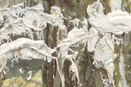
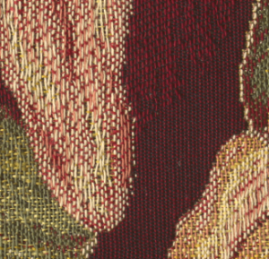
This sample shown is a project we did for a very exclusive interior designer scanned on the Cruse from an irreplaceable vintage fabric fragment.  The homeowner collects historic and vintage textiles, and it was a perfect way to display one of her most cherished pieces without compromising the original…  we can’t wait to see the foyer of the house it’s going up in!

Another project we had was to scan and print an original sample of wallpaper from the 1930s for a child’s nursery- again, a small fragment, now faithfully reproduced and there for generations to appreciate.  In this case the original was a hand-stenciled piece with the actual texture of the paint visible on the paper.  As you’d expect, the Cruse scanner lighting captured every nuance.

Not all our wallpaper projects are vintage historical pieces, though- remember, virtually anything that can be scanned, photographed or rendered digitally can be reproduced this way.  Drawings, photographs, samples, even the work of the artists of the preschool set can create their own, unique patterns!

If this gets your creative juices flowing, let us know, drop us a line.  There are some tricks to putting together a pattern that will hang and match correctly, but we’ve got plenty of experience working out the details.

-Ted Dillard
December 1, 2010

Adobe Releases Printer Utility- Fix For Printing With “No Color Management”

Filed under: Uncategorized — admin @ 5:58 pm

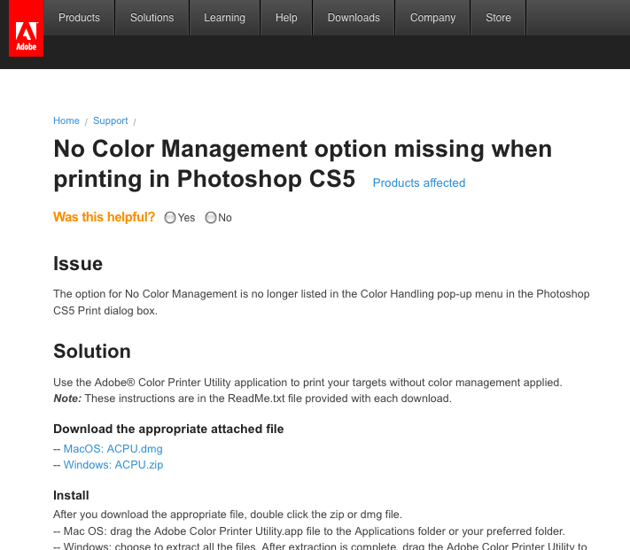
Not long ago we talked about trying to print for building profiles out of Photoshop CS4, and a somewhat kludgy workaround- printing from an old version of PS CS2.  That post is right here: Printing With “No Color Management” with the Epson 11880 (PS4 and Leopard) The short version of the story is that between Adobe, Apple and Epson, they messed with the color management of the application and drivers to the point that you could not print with the “No Color Management” selection in Photoshop.

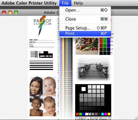
Adobe stepped up and FIXED THE PROBLEM!  How?  By incorporating some wonderful upgrade into Photoshop CS5?  By running some sweet upgrade of Photoshop CS4 and above?  Naaaah.  That would be too awesome.  Instead what they did was to build a dopey little application, the Adobe Printer Utility, that simply prints without Color Management.  Sweet.

Go here and download it.

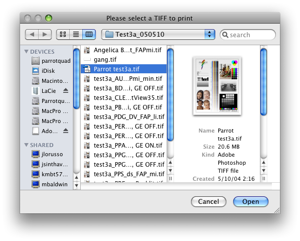
When you start it you get a screen like this:

I know.  What?

Anyway, open the file and you get this:

It’s awesome, isn’t it?  Then it just goes into the standard Epson/Leopard-SnowLeopard driver dialog where you turn the Epson Color Controls off.

If I may.  This is probably the lamest “fix” for an obvious and well-documented bug I’ve seen in the decade-and-a-half I’ve been playing this digital imaging game.  Please.  Spare me.  Oh wait.  According to this thread on Luminous Landscape, it’s buggy.  Resizes the image, so you can’t read them.  Never mind.  Forget I even mentioned it.

We’ve got to assume that there’s some Cold War of Pixels going on between Epson, Apple and Adobe for something this pathetic to come out of Adobe after the release of CS5.  There’s no other explanation that I can think of…  other than some engineer is having a tantrum and taking it out on all of us.  Thanks Adobe, I’d been tossing and turning at night trying to decide if I was going to spring for CS5…  think I’ll pass.

« Newer PostsOlder Posts »

Powered by WordPress